Alignment Feature
The alignment feature is used for positioning elements within the rows.
Settings
| Name | Description | Type | Default value |
|---|---|---|---|
$alignment-feature |
Alignment feature modes | Null/List | null |
$alignment-start-attr-addition |
Alignment start attribute addition | String | 'start' |
$alignment-center-attr-addition |
Alignment center attribute addition | String | 'center' |
$alignment-end-attr-addition |
Alignment end attribute addition | String | 'end' |
$alignment-top-attr-addition |
Alignment top attribute addition | String | 'top' |
$alignment-middle-attr-addition |
Alignment middle attribute addition | String | 'middle' |
$alignment-bottom-attr-addition |
Alignment bottom attribute addition | String | 'bottom' |
$alignment-stretch-attr-addition |
Alignment stretch attribute addition | String | 'stretch' |
Note: "start", "center" and "end" refer to the horizontal alignment. "top", "middle", "bottom" and "stretch" refer to the vertical alignment.
Example implementation

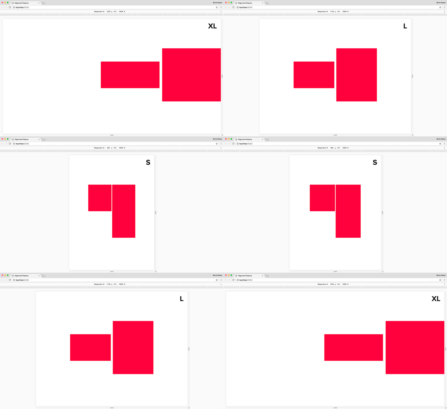
Initially all elements within the alignment element are centered horizontally and aligned to the top. Starting from breakpoint "m" they are positioned in the middle (vertically). In breakpoint "xl" they are positioned below (horizontally).
@include srgrid-create-grid(
    $alignment-feature: regular responsive
);
<div data-srgrid>
    <div data-srgrid-row="center top m-middle xl-end"> <!-- alignment element -->
        <div data-srgrid-col="10">
            <div class="box"></div>
        </div>
        <div data-srgrid-col="10">
            <div class="box box_large"></div>
        </div>
    </div>
</div>